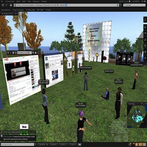
 It’s been a couple of weeks since Second Life’s Viewer 2.0 launched, and as always there’s been no shortage of comment. Gauging the balance is always a challenge, but I think it’s fair to say that overall the feedback has been overwhelmingly positive. The fly in the ointment has been the new search functionality, particularly its impact on live music events, with some musicians very frustrated at the setback although there doesn’t seem to be widespread concern.
For what it’s worth, I’ve found Viewer 2.0 has been a huge step forward, making me happier to log in each time. I’m not 100% sold on the new camera controls but that’s more an adjustment issue. Ron Blechner has a great summary of perceived improvements with his post 21 Reasons the New Second Life Viewer 2.0 is a Huge Improvement. Veteran SL resident Gwyneth Llewelyn has a brilliant tutorial for Mac users on optimising their Viewer 2.0 experience.
I’ve certainly been critical of Linden Lab over the years over updates that haven’t delivered or decisions that appeared short-sighted. With Viewer 2.0, it appears a more methodical approach to software development has paid off. It’s far from certain, and I’d suggest unlikely that Viewer 2.0 will drive more widespread adoption, but whether it does or not, it certainly appears to have made the majority of current users happier.
Over to you: do I have the rose-coloured glasses on or would you agree things have improved? I’d also love to hear from SL musicians who believe the search functionality has impeded their performance work.
Photo courtesy: Fleep Tuque
For folk with visual impairments and other disabilities who use SL, no, they haven't improved.