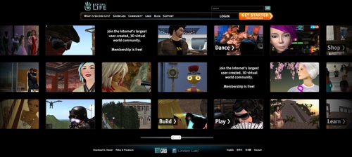
As announced on the official blog, the new design developed over recent weeks has gone live, initially for those not already registered as Second Life residents. The new version loaded for me this afternoon:

The re-design has attracted a lot of comment, a significant proportion of which has been criticism. For what it’s worth, I like the new design. Is it derivative? I believe so, but pretty much everything on the 2D web is. The new site does provide a real showcase of what Second Life has to offer, which must count for something. What are you thoughts – do you like it, hate it, or couldn’t care less?
I gotta say, I'm not all that impressed. Seems to often things are going to the flashy not real functional side just for the flash. This is just my opinion but I think it could of been a little better, less flash more fuction.
I gotta say, I'm not all that impressed. Seems to often things are going to the flashy not real functional side just for the flash. This is just my opinion but I think it could of been a little better, less flash more fuction.