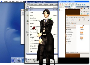
 If you’re a Mac user, you know you’ve got access to a whole slew of first-class applications. That is, apps that follow the user-interface style guidelines for the Mac. Painstakingly developed and tested over time, the guidelines ensure consistent layouts of menus, options and hotkeys, so that you don’t spend your time struggling to work out how to do the familiar, when you should be getting on with gaining expertise in the unfamiliar.
Windows also has it’s own user-interface conventions (though they are not so strongly adhered to), and Linux has its own body of user-interface conventions also (though mostly just a matter of custom).
The thing is, the applications that follow those local rules are quite simply easier on the user, and that gives them a popularity boost right there. You don’t have to think about the hotkeys for saving or quitting. You don’t have to search high and low to find preferences. Your first-class applications are all laid out in the same way, where they have anything in common.
Second Life, however, isn’t a native first-class application on any of the three supported platforms. It sports an interface that’s somewhat alien to all three. My contention here is that perhaps an attempt should be made to actually give the Second Life viewer an overhaul and actually give each platform a native-style first-class UI.
i.e: Have the Mac viewer follow the Mac UI conventions for menus, hot-keys, drag and drop. The whole nine-yards. Windows and Linux viewers should get their UI reworked to follow their local conventions, too.
Sure, there’s a downside to this. More limited opportunities for cross-platform tutorials and documentation, you’d need to triple-up in some cases. Plus extra work from developers and QA.
The question is, however, who are we supposed to be making the viewer UI easier for? Documenters, devs and QA staff, or the actual users? The unified cross-platform interface doesn’t do the user much in the way of favours, and frankly not many second-class applications ever really hit the heights of popularity on any platform. Without following native user-interface conventions, you’re ultimately deprecated somewhat by the very people you need to win over: the actual users.
Ultimately, though, this is something that needs to be proven out by experiment before you can say for certain that a first-class native-conformant UI will do a better job than the existing second-class UI.
With a variety of third-party Second Life viewers out there the question is, who will be the first to try the idea out? I don’t think it will be Linden Lab.
Unfortunately, what most of the opensource projects are doing is instead just targeting windows and pretending OS X and linux don't exist. See realXtend and Bubblecloud.org for two examples of this approach.
I'd far rather have a not-so-hot unified UI that I can run in OS X without ever having to touch windows than something with bells and whistles that I'm forced to either run windows or not use. I think heading in this direction is a bad move for opensource VW platforms.
You should definitely check out the results of Dusan Writer's User Interface contest a while back!
Yes, just assigning keyboard shortcuts would be too radical. I would drool over a purely-mac third party viewer if it were competitive though.
Second Life has a unique problem to solve and the answers aren't all in the OS that runs it. It does make a lot of sense to adopt consistent keystrokes and conventions from the supporting OS, since the best interface is always the one the user already knows. However SL is not just another app, SL's main paradigms are from 3D games and not productivity app's and, as we all know, many games come with their own UI you have to learn before playing.
Maybe, the goal should be to create a heuristic UI that is easy to master initially and reveals the inner complexity of SL only as the user demands it. The learning curve of SL starts with basic navigation and movement and ramps up to object creation, scripting, texturing, event management etc etc… So the interface of SL has to initially give easy-to-master access to a virtual world and, when the user is ready, access to the deepest structures that create that world. It's a tall order, not sure anyone's tried this before, and it probably needs it's own set of UI paradigms.
That's a really interesting idea. I wonder how much of my frustration with SL is a matter of reaching for system functions I'm used to in every other app on my machine. I've got a disability that makes ting without a spell checker a serious challenge and I doubt my situation is unusual.
*typing and no, it wasn't deliberate.
Targeting a single platform is certainly a black mark. “Go big or go home” as they say.
No, it isn't unusual. I am a mentor at Virtual Ability and we get a LOT of people coming through there.
No, it isn't unusual. I am a mentor at Virtual Ability and we get a LOT of people coming through there.