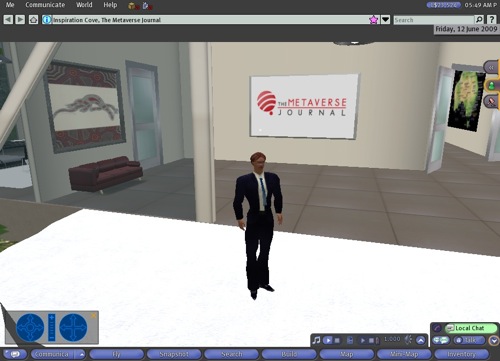
Back in June last year, we gave a sneak peek of the Second Life 2.0 viewer. At the time, Linden Lab stated it was only a very early iteration of what would be the final product. The imminent announcement by the Lab of the public beta for Viewer 2 certainly adds weight to that claim, given the much larger feature set of the near-final product.
Here’s the June 2009 version:

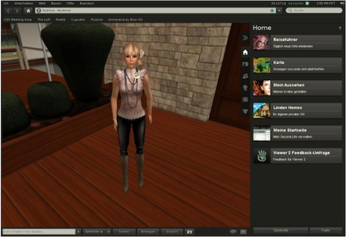
And thanks to some Viewer 2 documents accidentally placed on a public fileshare by the Lab, here’s a glimpse of the new (German) viewer:

(You can view the full size version here)
Cosmetically, things have obviously come a long way over the past 9 months. Under the hood, there’s also some big changes. Shared Media now allows for greater use of web content in-world. The viewer itself has the full web browser feel happening, which will no doubt engender some debate amongst longer term Second Life residents. The right hand favourites bar is certainly a big win compared to the current mess.
There are also other minor changes. Content ratings have had some name changes: ‘PG’ regions are now ‘General’, ‘Mature’ is now ‘Moderate’ and ‘Adult’ remains unchanged. Search functionality has been further tweaked with the Lab claiming a more intuitive search experience. Another plus: the system requirements for Viewer 2 are no different to version 1.23, so no-one is locked out from upgrading. Version 1.23 will remain viable until 30 days after version 2.1 is released – version 1.22 is now on a (deserved) 30-day countdown to extinction.
Overall, Linden Lab deserve kudos for delivering a significantly revamped viewer that should make using Second Life markedly easier for new residents in particular. Linden Lab have consistently stated their commitment to improving the user experience and this is one of the more concrete examples of how that is now being delivered. The proof of Viewer 2’s success will only come with widespread use, but initial impressions are positive. Of course, Linden Lab need to pull off a usability coup to ensure ongoing growth. Combined with potential improvements in grid performance, the horizon seems a little brighter than it has been in a while.
Over to you: what do you think of Viewer 2 from the brief glimpse provided? Is it a revolution or just steady evolution?
Update – here’s some other reactions:
1. Tateru Nino has a great roundup of features.
2. Linden Lab’s announcement, including a quick tour:
I love the new look. Hopefully it didn't break features for Opensim use. Either way looks very modern & well thought out.
Great article and wow very interesting! It kind of reminds me of a browser– it looks more universal. I hope the advanced settings aren't hard to find though– for machinima's sake 🙂
I like having the location bar on top.. hopefully, this will make it easier to do hypergrid teleports in OpenSim.
The big questions for me are — will this support full 3d meshes? And does it fix the 4096-region teleport bug?
— Maria Korolov
Editor, Hypergrid Business
http://www.hypergridbusiness.com
This is a good thing. The familiar browser interface is something that new users will find easier to use. Existing users may be a little frustrated (Linden Lab admits this on their blog), but none of them will leave as a result. The goal, for Linden Lab, is to address the usability concerns of many new users (50% of whom sign into Second Life once and never return).
the pictures are nearly 1 year old *loool*
Quite smart to go with a browser paradigm, being what newbies and all of us are comfortable with. Personally I love how they have hidden all the advanced settings 🙂
Such a nice video and I was too enjoy while watching the video.Thanks for the sharing