Linden Lab is cutting the Second Life Community Gateways programme from August 19 (giving Community Gateway operators just 18 hours notice of the pending termination). If you haven’t been through the Second Life orientation lately, you might not even be clearly aware of what the programme is.
The idea was simple enough. Since the Lab didn’t care to have a full-time employee doing the necessary work on new user orientation, a variety of groups who thought they could outdo the Lab were presented as optional starting areas for new users.
Not everyone was right. Even compared to the standard orientation experience’s very low bar, some of the Community Gateway experiences apparently “stank on iceâ€.
Some did okay though. There used to be a Google spreadsheet circulating around with various specifics of the CG programme, though I lost the link some time ago. What struck me is how small a number of the total pool of new signups took the Community Gateway option.
Indeed, according to the Lab, many gave up on the Web-site when presented with the choice of going to a Community Gateway or taking the standard orientation experience.
Think about that for a moment.
Presented with the choice, many users chicken out and we may never see them again.
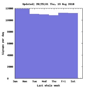
 It’s certainly popular wisdom that 30% of new users don’t actually ever log in. I don’t know if that’s still true now, five years later, or not. I’m not sure if that’s a figure that the Lab would really be all that keen to share lately. There’s between ten and twelve thousand new Second Life signups every day, but it doesn’t seem like more than a couple of hundred actually make it through the proverbial first-hour.
In what seems like a startling digression, there’s an interesting balancing act I can tell you about in writing for the Web. It isn’t really all that startling a digression, as you’ll notice in a moment.
Articles with more than one part are obviously preferable from a page-view perspective. More page-views means more advertising dollars, so if you want more advertising dollars then you want more page-views.
Simple, you think, I will break my article up into parts! Each time the user clicks through, that will be another page-view!
But it isn’t so easy. A lot depends on who you are, who your audience is and what your article is about, but a good rule of thumb is that 25-30% of your readers won’t click through to the second page. 25-30% of those that do won’t click through to the third page. And so on.
It’s easy to watch that process from the Web-traffic logs, and get solid numbers, and they’re numbers that remain surprisingly consistent. It isn’t even as if you’re asking the user to make much of a choice. It’s just “click the link for the next part.â€
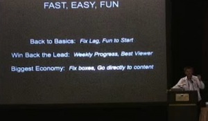
So, yes, the Lab – while criticized at the time for it – was definitely right to shorten the number of steps in registration. Every click (and every choice) between the start of registration and actually turning up in Second Life with a prefab avatar you’re losing attention, and thus bleeding out audience.
That’s why the whole Second Life viewer in a browser keeps coming up over and over again, hiding software downloads, updates and installs from the user and all of that. For now, the Lab is going to just use its own orientation system, presumably until they follow-through on announced plans to eliminate that as well.
Eliminating even one step could cause a massive jump in retention, if it is done right. Just reducing the number of clicks and choices willy-nilly and without planning isn’t necessarily going to improve matters. You might get more people actually logging in, but who are simply unprepared for the welter of possibilities that the virtual environment then presents to them.

 1. Computing (UK) –


Recent Comments